 |
| 3 minute sketches |
 |
| 10 minute sketches |
 |
| 5 minute sketches |
 |
| 5 mins and 15 mins |

 |
| 5 minute pastel sketches |
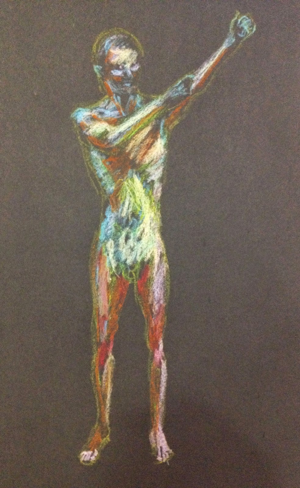 |
| shooting an arrow - 10 minute sketch |
 |
| half hour standing study |

 |
| chalk and charcoal on black sugar paper |
 |
| chalk and charcoal on black sugar paper |
 |
 |
| 5 minute poses with chair (pencil and ink pen on bottom right) |
 |
| 20 minute study in pencil |
 |
| 20 minute study in pencil |
 |
| 5 mins poses in blue and green ballpoint pen |
 |
| 10 minute seated pose in blue ballpoint pen |
 |
| 10 minute charcoal pose |
 |
| 10 minute charcoal, 5 minute chalk pose |
 |
| 2 minute chalk 2 minute charcoal pose |
